Thara Coffee
Logo, Brand Identity System & Packaging Design
Overview
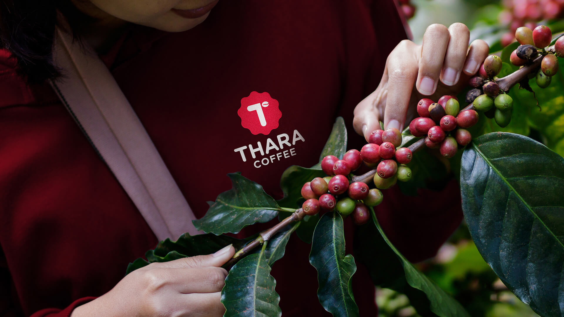
We’ve crafted a unique mark by fusing the letters ‘T’ & ‘C’, where ‘C’ in the shape of a coffee bean represents the core business of the brand. Inspired by the shape of coffee leaves, a strong shape was created around the monogram to make it more effective and prominent.
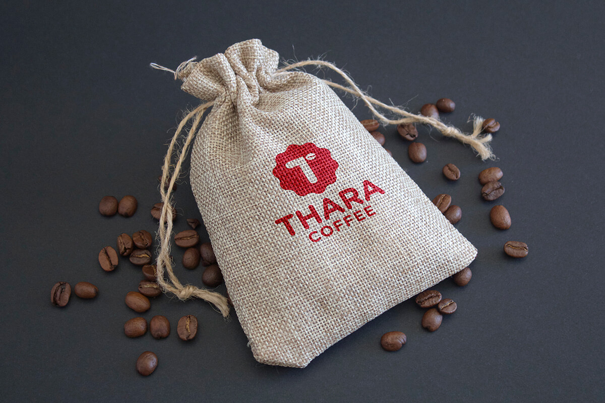
Upon completion of the Brand Identity Design, we proceeded further to craft its packaging designs for the new range of South-Indian Filter Coffee Blends. We have focused to create a vibrant & dynamic packaging design that is elegant yet memorable.

#40, Ground Floor, 1st Cross,
NGEF Lane, Indira Nagar II
Stage, Bangalore 560038,
Karnataka, India.