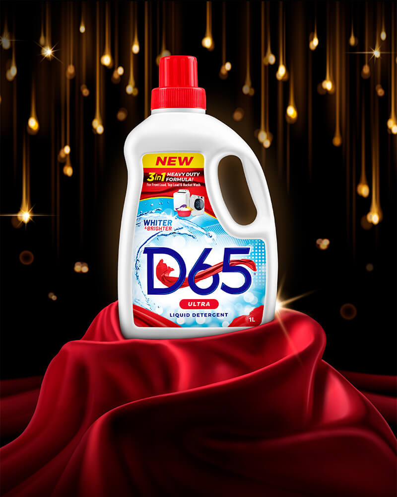
We crafted a unique, custom-made logo for D65 Ultra Liquid Detergent that is both memorable and visually appealing. The logo features a captivating red flying cloth intricately woven into the custom-made D65 typography. The choice of the red flying cloth as a symbol was deliberate, representing movement, freshness, and dynamism, perfectly aligning with the product’s attributes. The design process involved meticulous attention to detail, ensuring that the red flying cloth appears as if it’s in motion, evoking a sense of energy and vitality. The new brand identity has given the product a significant competitive edge, setting it apart in the crowded detergent market.
This distinctive logo & a complementing package design have already begun to make a strong impression in the industry, capturing the attention of consumers and establishing a memorable brand presence.